using DrWatson
using DataFrames
using Arrow
using StatsPlots
using LaTeXStrings
using Distributions

using BioFindr
Precompiling packages... 2247.8 ms ✓ QuartoNotebookWorkerPlotsExt (serial) 1 dependency successfully precompiled in 2 seconds
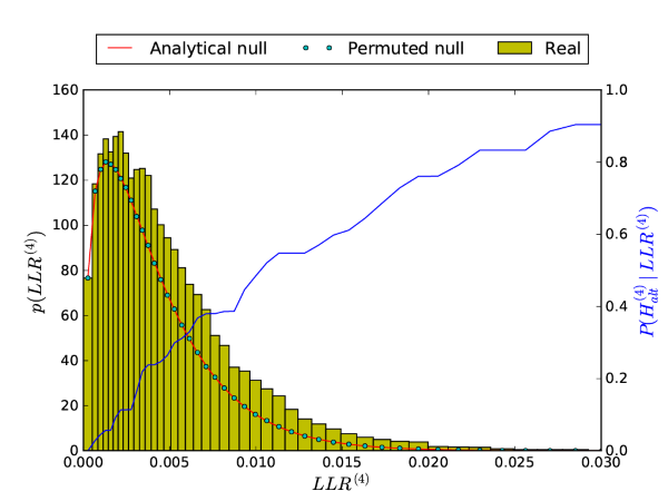
The only functions exported by BioFindr are the findr and dagfindr! functions. Nevertheless, many of the internal functions may be useful when digging deeper in the results for specific genes. The package documentation contains detailed descriptions of all package functions, intertwined with the methods section of the original paper, and should give a good overview of what is available. To illustrate how these functions can be used, we will reproduce the following figure (Supplementary Fig. S1 from the original paper):
using DrWatson
using DataFrames
using Arrow
using StatsPlots
using LaTeXStrings
using Distributions
using BioFindrPrecompiling packages... 2247.8 ms ✓ QuartoNotebookWorkerPlotsExt (serial) 1 dependency successfully precompiled in 2 seconds
You should by now be familiar with the GEUVADIS data used in the First steps tutorials. Here we need the following files:
dt = DataFrame(Arrow.Table(datadir("exp_pro","findr-data-geuvadis", "dt.arrow")));
dm = DataFrame(Arrow.Table(datadir("exp_pro","findr-data-geuvadis", "dm.arrow")));
dgm = DataFrame(Arrow.Table(datadir("exp_pro","findr-data-geuvadis", "dgm.arrow")));
We also need the microRNA eQTL mapping (see the causal inference tutorial):
dpm = DataFrame(SNP_ID = names(dgm), GENE_ID=names(dm)[1:ncol(dgm)]);Set the microRNA of interest:
mirA = "hsa-miR-200b-3p";Internally, all BioFindr functions use matrix-based inputs and supernormalized data. The easiest way to convert our data is to run supernormalize on the initial data:
Yt = BioFindr.supernormalize(dt);
Ym = vec(BioFindr.supernormalize(select(dm,mirA)));
For the genotype data, no conversion is needed:
E = dgm[:, dpm.SNP_ID[dpm.GENE_ID.==mirA][1]];We will also need the number of samples and number of genotype groups:
ns = length(E);
ng = length(unique(E));Throughout the package, the likelihood ratio tests are labelled by the following symbols
:link:med:relev:pleioSince all log-likelihood ratios are computed from the same summary statistics, a single function computes them all. To compute the log-likelihood ratios for a specific A-gene (here: hsa-miR-200b-3p with column vector of expression data Ym) with a causal instrument (best eQTL) with genotype vector E, run:
llr2, llr3, llr4, llr5 = BioFindr.real_llr_col(Yt, Ym, E);If you know you’re only going to use one of them, you can also run:
_ , _ , llr4 , _ = BioFindr.real_llr_col(Yt, Ym, E);Posterior probabilities are computed by fitting a mixture model to the observed vector of log-likelihood ratios. Two fitting methods are implmented: a method of moments or using kernel density estimation. The method of moments is the default:
pp_mom, dmix = BioFindr.fit_mixdist_mom(llr4, ns, ng, :relev);The KDE estimate is obtained similarly:
pp_kde = BioFindr.fit_mixdist_KDE(llr4, ns, ng, :relev);The method of moments has a second output argument, dmix, a mixture model distribution object where each mixture component is an LBeta dsitribution:
dmixMixtureModel{BioFindr.LBeta}(K = 2)
components[1] (prior = 0.7493): BioFindr.LBeta(α=3.0, β=356.0)
components[2] (prior = 0.2507): BioFindr.LBeta(α=3.0282774935811334, β=176.3802554867402)The first component in the mixture model is the null distribution, which can also be created as follows:
dnull = BioFindr.nulldist(ns,ng,:relev)BioFindr.LBeta(α=3.0, β=356.0)The prior of the null component is the estimated proportion of truly null features in the observed log-likelihood ratio vector llr4:
π₀ = dmix.prior.p[1]0.749319028759546We can verify that both methods (moments and KDE) give similar posterior probabilities
scatter(pp_mom,pp_kde, markersize=4)
We don’t need null p-values to reproduce the figure above, but they can be used to assess the quality of the \(\pi_0\) estimate.
pnull = BioFindr.nullpval(llr4,ns,ng,:relev);We can verify that the histogram shows the characteristic shape of a set of anti-conservative p-values and that \(\pi_0\) correctly estimates the height of the “flat” portion of the histogram near \(p\approx 1\):
histogram(pnull, normalize=:pdf, bins=100, label="")
hline!([π₀],linewidth=2, label="", linecolor=:red)
xlims!(0,1)
xlabel!("Null p-value")
ylabel!("Observed distribution")
annotate!(0.95,0.95, (L"\pi_0", 18, :red))
For the method of moments, the null and real log-likelihood ratio distribution are available in the form of distribution objects, and we can simply evaluate their pdfs on a range of values:
lval = range(0,maximum(llr4),500);
pnull_val = π₀ * pdf.(dnull,lval);
preal_val = pdf.(dmix,lval);
pp_val = 1 .- pnull_val ./ preal_val;
Plot the final figure:
histogram(llr4, normalize=:pdf, bins=100, color=:navajowhite1, label="Real data", size=(600,450))
plot!(lval,preal_val, linewidth=2, color=:black, label=L"p(LLR^{(4)})")
plot!(lval,pnull_val, linewidth=2, color=:red, label=L"\pi_0 p(LLR^{(4)} \mid \mathcal{H}_0)", legend=(0.25,0.95))
ylims!(0, 160)
xlabel!(L"LLR^{(4)}")
ylabel!(L"p(LLR^{(4)})")
plot!(twinx(),lval,pp_val, linewidth=2, color=:blue, label="", yguidefontcolor=:blue, ylims=(0,1.), ylabel=L"P(H^{(4)}_{alt} \mid LLR^{(4)})")
#ylabel(L"P(H^{(4)}_{alt} \mid LLR^{(4)})")
xlims!(0,0.03)
Compared to the figure at the top of the page, we see that the method of moments provides a smooth fit to the histogram and consequently also posterior probabilities that increase more smoothly with increasing LLR values.
For the KDE method, we don’t have a distribution object fitting the histogram. Instead with use kernel density estimation and return estimated pdf values at every value of the LLR input vector:
preal_kde = BioFindr.fit_kde(llr4);For plotting, we filter a relevant range of values from all vectors:
rg = 1:50:length(llr4);
t = sortperm(llr4);
lval_kde = llr4[t][rg];
preal_val_kde = preal_kde[t][rg];
pp_val_kde = pp_kde[t][rg];
And plot the figure again:
histogram(llr4, normalize=:pdf, bins=100, color=:navajowhite1, label="Real data", size=(600,450))
plot!(lval_kde,preal_val_kde, linewidth=2, color=:black, label=L"p(LLR^{(4)})")
plot!(lval,pnull_val, linewidth=2, color=:red, label=L"\pi_0 p(LLR^{(4)} \mid \mathcal{H}_0)", legend=(0.25,0.95))
ylims!(0, 160)
xlabel!(L"LLR^{(4)}")
ylabel!(L"p(LLR^{(4)})")
plot!(twinx(),lval_kde,pp_val_kde, linewidth=2, color=:blue, label="", yguidefontcolor=:blue, ylims=(0,1.), ylabel=L"P(H^{(4)}_{alt} \mid LLR^{(4)})")
#ylabel(L"P(H^{(4)}_{alt} \mid LLR^{(4)})")
xlims!(0,0.03)